City Edition jerseys are not only a nice way to sink some money into your fandom but they also provide a lot of content. There’s something special about #NBATwitter turning into Fashion Twitter whenever teams unveil their new uniforms.
Do teams have to come out with new jerseys every year? Probably not. The Utah Jazz and Phoenix Suns, in fact, just went with their City Editions from last season since they were already pretty good. But it's nice that teams and Nike at least try to be creative with their yearly offerings.
In this article, I go over my five favorite jerseys and a few honorable mentions. It’s important to emphasize that this is subjective. I value jerseys that balance just enough flare with legibility. Jerseys, after all, do serve the purpose of saying who the player is and what team they play for. So jerseys like the kidnapper-chic Miami Heat jerseys with mismatched letterings from different eras and the Charlotte Hornets’ honeycomb-pinstripe-gradient combo really don’t do it for me. These two designs have their fans on Twitter, but, in the spirit of solid jersey design, they missed the mark for me. If you’re a Heat or Hornets fan, don’t let me stop you from liking your jerseys.
Teams tried to celebrate their different eras as the NBA celebrates its 75th anniversary—that’s why the official marketing name for this year’s jerseys is the Mixtape Edition. This could have been a disaster for teams that just threw all the symbols they could into a jersey, but there are some great designs this season.
Atlanta Hawks
Views in the new City Edition jerseys 📸
— Atlanta Hawks (@ATLHawks) November 5, 2021
Presented by @SociosHoops pic.twitter.com/vmWc2kFs0G
The Hawks are one of the teams that put together a nice blend of new and old. Combining the lettering from the ‘70s Pistol Pete era with the giant angry, basketball-clutching bird from the ‘90s was inspiring. Going with the striking mustard yellow – a color they only majorly featured now – for the main color brings this whole jersey together. They even had an alternate home floor—with the angry bird logo at center court—that complements this jersey on television.
These are hands down the best Hawks City Edition jerseys. If you’re a local basketball fan, these would also look great as your ‘fit for San Sebastian College games.
Memphis Grizzlies
Memphis low-key always drops some great jerseys. Last year’s was a masterpiece of a tribute to the city’s musical roots, specifically to Isaac Hayes. This year, they brought back the angry bear from their early years in the mid-’90s in the best way possible.
The top features homages to past Grizzlies teams with the solid blue body and yellow lining from the Grit ‘N Grind era. The lettering is from their fairly recent rebrand but they put some subtle scratch marks on it. They even brought back some of the ornate patterns around the neck and armholes.
But the best part of this jersey are the shorts as the angry bear is blown up, dribbling menacingly on the left leg. If they make the warmups available, it will be another underrated drop for the most underrated in the league.
Brooklyn Nets
Speaking of the best City Edition designers, the Nets have been releasing top-tier jerseys almost every year. The designs are always great but the novelty of seeing their stars hoop in something other than their plain black-and-white get-ups seems to add to the experience.
They already paid homage to the ‘90s last season with their baby blue tie-dyed digs. They reached back into that as well this season by bringing back the same logo from the Drazen Petrovic era. Then they went ABA on us with the red, white, and blue color theme with the psychedelic stars and stripes along the left side.
The throwback court design to the 2000s New Jersey era was very much appreciated for the nostalgia-starved millennial fanbase. It’s another reminder that the Nets are a transplant team in the largest transplant borough in New York.
Los Angeles Clippers
As the baby brother team in Los Angeles, the Clippers don’t have a ton of fond memories to pull inspiration from. They also haven’t been great at designing City Edition jerseys for their burgeoning fanbase.
But they hit the mark with these Mixtape joints. The baby blue, white, and orange combination is perfectly balanced. If the orange was just a touch off-hue or if the baby blue was even a smidge too light, this might have not worked. They even did a great job at blending the Buffalo era numbering, the San Diego pattern, and the Knuckleheads era lettering. Everything looks so cohesive.
As it stands, these are the Clippers’ best City jerseys to date. We finally have a nice Paul George/Kawhi Leonard jersey to cop.
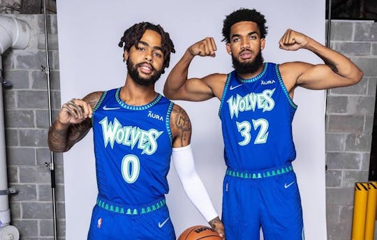
Minnesota Timberwolves
Minnesota hasn’t been great on the court in a while, but they always come out with great uniforms.
This year, they brought back the most beloved feature of any Timberwolves jersey ever: the pine tree linings along the neck and armholes. Just that would have made Wolves fans happy but they splashed the young KG-era lettering across the chest, along with the brighter blue of that era in the front of the jersey.
On the sides, they did some nice lines into a gradient for the darker blue colors of the current Minnesota era. This has been the best use of gradient by any team ever as it was used just enough to add a nice twist to the execution of the design.
Their Prince jerseys from 2018 deserve a spot in the jersey hall of fame. While this year’s isn’t as drop-dead gorgeous as that design, these Mixtape editions are still worthy of a cop.
Honorable mentions
Out of all the Los Angeles Lakers’ colors, purple is the hardest to make work. It’s almost too loud of a color to use as the dominant color, especially when the signature Lakers gold is so iconic. This year, the Lakers finally made it work by using their ‘50s baby blue touch for the lining.
Detroit teased us. This would have been the perfect time to bring back the teal with the flaming horse logo, given the theme and the excitement around their new, Grant Hill-like star in Cade Cunningham. They gave us a tiny dose by having teal highlights around the linings. But we can’t be mad at the terrific use of red – a color they have not often featured throughout their history.