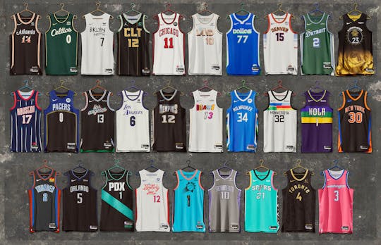
This season's City Edition jerseys were all officially revealed on Friday. Since the league and Nike started this trend in the 2017-2018 season, there have been some awesome designs, which makes a lot of people wish their teams kept those designs in the regular rotation. There have also been some huge whiffs, which is why it's ultimately a good thing they change designs annually.
This year, teams really tried to be creative with how they honor their city, which was the original thesis for this initiative. Per usual, we got some hits and some duds. Here, we don’t just go through the best but we also take a look at some of the new jerseys that are an inch away from greatness and those that are miles off.
Actual molten heat 🔥
Cleveland Cavaliers
Cleveland Cavaliers x Cleveland Metroparks 🌳
— Cleveland Cavaliers (@cavs) November 10, 2022
Presenting our 2022-23 City Edition Jerseys, designed by @DanielArsham.
The Cavs have been figuring out the City Edition jersey game since their truly forgettable 2017 design. This year, The Land gets its redemption.
Taking inspiration from Cleveland Metroparks, Cavaliers Creative Director, and internationally renowned contemporary artist Daniel Arsham drew up an incredible design for this jersey. The white uniform makes the subtle colors of this jersey pop. It also features several odes to past Cavaliers in the typeface and logo used.
The best thing to come out of this jersey is the Lake Eerie Blue featured on the logo and trim. The Cavaliers should consider making that color a part of their standard set.
Even the jersey sponsor’s logo complements every other element. The Cavaliers really hit the “natural look” that’s pretty hard to incorporate in fashion. They also get a big bonus for the solid court design that comes with this jersey.
Where water meets THE LAND.
— Cleveland Cavaliers (@cavs) November 10, 2022
Inspired by the miles of Lake Erie coastline and the incredible natural resources that make up our region.
Presenting our 2022-23 City Edition Court, designed by @DanielArsham. pic.twitter.com/hdTRT50zet
Memphis Grizzlies
The Grizzlies are one of the most exciting teams in the league. Capturing the youth and energy of their roster and somehow incorporating it into the City Edition designs is quite impressive.
a uni for the ??
— Memphis Grizzlies (@memgrizz) November 10, 2022
Last season, the Grizzlies pulled inspiration from Memphis’ rich soul music history. This year, they continued to highlight Memphis' music scene with the hip-hop, blinged-out motif.
The chrome and other shiny details scream early 2000s flex hip-hop. The typeface also captures some history with subtle details incorporated from their early years in Vancouver.
The best details are the bronze grizzly bear on the shorts and the “MG” lettering on the side panels. This jersey looks every bit as tough and valid as Ja Morant’s game. Memphis is the coolest team in the league.
Phoenix Suns
Introducing our 2022-23 NIKE NBA City Edition uniform honoring the 22 Tribal Nations of Arizona.@PayPal | Learn more at https://t.co/1jC1cW5h8g pic.twitter.com/QTFTUOwosP
— Phoenix Suns (@Suns) November 10, 2022
The Suns may be going through a bit of a rough patch on numerous fronts. At least, they haven’t lost their magic with the City Edition jersey designs.
Phoenix is one of the few teams in the league that tries to represent their state, not just their city, to enrich their sports culture. This year, they paid tribute to the Native American culture in Arizona.
The striking turquoise shell the jersey comes in is inspired by Native American protection stone. The black tape that runs down the side of the jersey and shorts has the word “sun” in each of the Native American languages in Arizona. The shorts have great small details like the white belt pattern on the elastic and the tiny arrows on the bottom trim.
There are even tiny pops of colors inside the numbers on the front and the back of the jerseys. The only issue with this design is the Suns sunburst logo. There was an opportunity here to feature the colorful PHX logo on the buckle more prominently on the jersey itself. Perhaps on next year’s jersey?
Boston Celtics
The Boston Celtics will always be working with a handicap every year they have to come up with a new jersey design. Perfection in sports is hard to achieve and beat, and the Celtics have that in their iconic standard design. It still feels weird when the Celtics play at home in their away green joints.
Boston doesn’t usually create anything remarkable in the new jersey department but this year they hit it out of the park. Paying homage to legend Bill Russell, who passed away earlier this year, the Celtics scattered different cool details in this year’s City Edition jersey.
The “Champion of Gold” design features some tasteful use of gold on the trim, typeface, and Nike logo. They also have 11 diamonds on the side panels, representing the 11 titles the Celtics won in the Bill Russell era.
This is the first Celtics alternate truly worth a cop, even if you’re just a casual Jayson Tatum fan. Maybe paying tribute to their greats annually is the key to producing consistently solid alternate jersey designs.
Detroit Pistons
🚨The Saint is Live🚨
— Detroit Pistons (@DetroitPistons) November 10, 2022
Our 2022-23 City Edition is available now!
Click link to purchase: https://t.co/Vx6eToYRup pic.twitter.com/TMaMwUL5LW
Taking a piece of your city and a great story – this is what the City Edition jersey was made for and the Pistons hit it on the nail with this year’s design.
Highlighting the legendary St. Cecilia’s Gym, the jersey features the green colors from the walls of the gym, St. Cecilia’s motto “Where stars are made, not born”, and the gym’s stained glass windows. The design also features some unique Americana in the typeface, which includes three stars to represent the Pistons’ three NBA titles.
St. Cecilia’s story is a unique place, which deserves to be preserved in any way possible. This is, after all, where NBA legends like Magic Johnson, George Gervin, and Glenn Robinson played as kids. We need more stories like this told through these jerseys.
You've seen the new @DetroitPistons City Edition jerseys, now hear more of the backstory behind them.
— Bally Sports Detroit (@BallySportsDET) November 10, 2022
Our @grantlong43 discusses what he learned while showing up to St. Cecilia's gym in Detroit as a young player. ??🏀#Pistons pic.twitter.com/Z3H7GQNJ4i
Just one suggestion…
Washington Wizards
Taking a bit of a cue from the Nationals, the Wizards used Washington’s cherry blossom trees as inspiration for this year’s City Edition kits.
double-double for kuz 👀
— Washington Wizards (@WashWizards) November 11, 2022
📊 36 PTS, 10 REB, 7 AST pic.twitter.com/8uwkTrZXrM
The pink jerseys look great on the court with the touch of blue gradient on the shorts. The blossoms running down the side give the jersey a unique, non-geometric side panel.
The only detail this jersey misses on is the typeface. A unique font for that then maybe having more blossoms on the lettering could have tied the design together.
Portland Trail Blazers
It's all in the details #RIPCITYCARPET
— Portland Trail Blazers (@trailblazers) November 10, 2022
BUY NOW » https://t.co/jNjaT6QY1M
PHOTOS » https://t.co/oBQ8hH06UH pic.twitter.com/HUa9QlaaTa
This is the most regional, most endemically-inspired design ever. Using such distinct minutiae only known to people from Portland? That’s almost as Portland as cheddar cheese, refurbished bikes, and Fred Armisen.
The Blazers used the apparently iconic design of the Portland International Airport carpet design as the main embellishment of this jersey. The mint blue has been a hit around the league and that stays true in this design.
For a jersey so out of left field that it barely uses any of the team’s original design, the Blazers could have incorporated some more familiar details so that it’s easier to figure out that this is a Blazers jersey. Maybe discarding the PDX and going with Portland or their logo would have set this design off.
What are those?
Los Angeles Lakers
From their city rich with culture from all over the world to their team’s illustrious history, the Lakers should never lack inspiration for jerseys or anything design-related.
Usually, the Lakers used the City Edition kits to pay tribute to team legends. This year, they got too into their feelings.
Keeping things clean with the 2022-23 City Edition Uniform.@bibigousa x #LakeShow
— Los Angeles Lakers (@Lakers) November 10, 2022
The press release describes this jersey as “intentionally stripped back” to represent Los Angeles coming together as a city. What we actually get is a plain white jersey that looks like someone just haphazardly printed the Lakers’ branding on it.
This jersey is as confusing as the Lakers are as an organization. Lately, the Lakers haven’t been able to do anything great.
Charlotte Hornets
This one's for those who never settle. This one's for you, CLT. #LetsFly | @LendingTree pic.twitter.com/T8YQS9rUSu
— Charlotte Hornets (@hornets) November 10, 2022
From the gold, the mint, the black, and the pinstripes, there are some great moments on this jersey. It just gets ruined by the use of Charlotte airport code CLT – a pretty salacious combination of letters.
Also, saying “If you don't think Charlotte has culture” in the launch video was a funny self-own. Teams should calm down with the spoken word poetry for their jerseys.
Sacramento Kings
For the Proud 🔥👑 pic.twitter.com/Wy0JB26Mqq
— Sacramento Kings (@SacramentoKings) November 10, 2022
There are some okay details on this one but gray has never looked good on a basketball jersey.
Minnesota Timberwolves
BTS 📸 pic.twitter.com/nHZbmloL0x
— Minnesota Timberwolves (@Timberwolves) November 10, 2022
Maybe this is grading the Timberwolves on a scale but it doesn't help to look at this year’s rough design knowing that this is the same franchise that came up with the incredible Purple Rain jerseys a few years ago. The patterns being different for every individual jersey is sort of nice but it feels like they didn’t lean into the artists, who apparently inspired these jerseys, enough.
Golden State Warriors
You saw it here first 🤫@Rakuten || #Empowered pic.twitter.com/sp4aqfX3SW
— Golden State Warriors (@warriors) November 10, 2022
The sentiment is great – women empowerment is a worthy inspiration. But the designer didn’t think enough about the practicality of their design. This is what it will look like on the court when players tuck their jerseys in:
Full lineup 😎 @Rakuten || #Empowered pic.twitter.com/MaEm1RIFUZ
— Golden State Warriors (@warriors) November 10, 2022
The flower will be hidden and this jersey will look like a regular Warriors black alternate. This is a big head-scratcher.


